The Web is Mobile
At my last job, I watched first hand as our North American web traffic shifted from 40-50% mobile to 60-70% mobile. In Asia, mobile traffic was higher and always had been higher. As part of the mobile dev team, even armed with traffic data, it often felt little hard to convince other teams of that trend. Why don’t they see how important mobile is?
I was reminded of this the other day when I was looking at traffic for mayneislandcommunitycentre.com. Even this small website, in a small community, shows similar data:
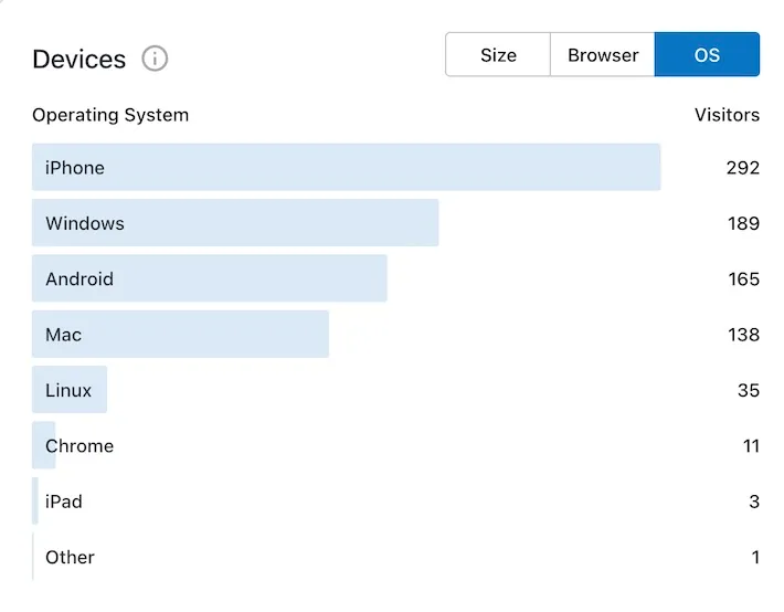
iPhone is 35% (292 of 834) of traffic and Android 20% (165 of 834) for a total of 55% of traffic over the 30 days. I’ll admit it’s not quite as high as I observed at work but higher than I expected which I find funny. Why didn’t I expect high mobile traffic? I spent years advocating the very fact that the majority of traffic is on mobile devices. Now I’m that other team who seems to have forgotten the web is mobile first.
Aside: I’m also very curious who that 4% Linux traffic is but I’m not sure wordpress.com gives me many tools to dig further.
Why I’m surprised
I think it’s very easy to take my own experience or usage and project it onto others. I don’t love browsing the web on mobile and, as a software guy, I’m often tinkering on my computer so I guess I expect others are like that. I expect others will prefer their laptop over their phone but it’s not true. Most people access the internet on whatever device is closest and for most people, that’s their phone.
There is a similar saying about cameras popularized by Chase Jarvis:
The best camera is the one that’s with you.
I started using computers in the 90s where my first experience with the internet was on a desktop computer. Most of the people I worked with had a similar experience and, to compound it, we were all working on computers and using those to access the site. We project our experience onto everyone else.
I think the lesson here is that it’s hard to see our own bias. For me, it’s another reminder of the value of diverse teams and diverse opinions.
Implications of mobile
Given that the web is mobile first, what does that mean for software and web design? I’m not a graphic designer, so I can’t really comment on colours or layout or typography. Those things are important but, for me, I do still keep a few things in mind when building for mobile:
- Thumb reach affects where you position content and controls and also how big your touch targets are. Mobile devices are often held with one hand and moving your thumb over the screen can cover targets or content. Nielsen Norman Group has some great advice on this.
- No hovering. A common pattern, on desktop, is to add subtle animations on hover. Expand something a little or reveal bits of information. Animations can be distracting but they can also make a site feel fun and interactive. Mobile devices don’t (generally) have a pointer so hover effects don’t work.
- CPU time equals battery usage. I may be overly opinionated but I prefer a JS free web for mobile because websites load faster and my device battery lasts longer. I use my device when I’m out of the house and I would gladly tradeoff time to load, animations, and transitions so I can use the device longer.
- Touch screen typing is annoying. Maybe it’s just me, but I do not love typing on a touch screen. As I said above, I grew up with a physical keyboard and have adapted to touch screens but it’s not what I grew up with. Regardless of the reason, I try to avoid forcing my users to type if possible. For example, I might provide a few one-touch targets in addition to a search box to help a few users avoid typing.
If you try out dunshire DOOM on your mobile device and compare it to desktop, you may see some of these lessons applied. You can probably also find ways to improve it. I’m always learning!